Introduction
How to Make CSS Background Image Fit to Screen – Create a Responsive CSS Background Image Now
Making your website’s background image responsive is crucial for providing a seamless experience across different devices. In this guide, you’ll learn how to make a CSS background image fit perfectly to the screen, ensuring it looks great on desktops, tablets, and mobile phones.

Step 1: Setting Up Your HTML Structure
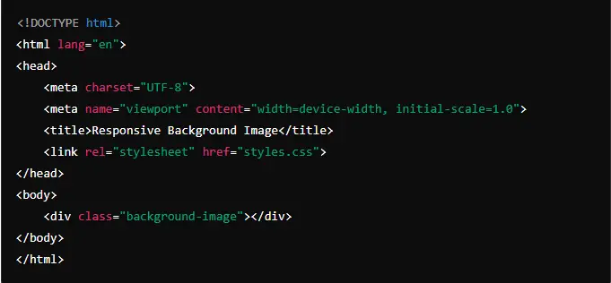
- Create a Basic HTML FileStart by creating a basic HTML structure. Open your text editor and add the following code:htmlSao chép mã
<!DOCTYPE html> <html lang="en"> <head> <meta charset="UTF-8"> <meta name="viewport" content="width=device-width, initial-scale=1.0"> <title>Responsive Background Image</title> <link rel="stylesheet" href="styles.css"> </head> <body> <div class="background-image"></div> </body> </html>This code sets up a simple HTML document with adivelement that will hold our background image.

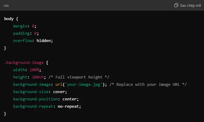
2. Add CSS StylesCreate a CSS file named styles.css and add the following styles:cssSao chép mãbody { margin: 0; padding: 0; overflow: hidden; } .background-image { width: 100%; height: 100vh; /* Full viewport height */ background-image: url('your-image.jpg'); /* Replace with your image URL */ background-size: cover; background-position: center; background-repeat: no-repeat; } In this CSS, we set the background image to cover the entire viewport while maintaining its aspect ratio.

Step 2: Adding the Background Image
- Upload Your ImageUpload your chosen background image to your website’s directory. For example, if you’re using Hostinger, you can upload the image to your file manager.Learn more about Hostinger’s file manager here.
- Link the Image in Your CSSUpdate the
background-imageproperty in yourstyles.cssfile with the path to your image:cssSao chép mãbackground-image: url('path/to/your-image.jpg');Ensure the image path is correct relative to your CSS file.

Step 3: Making the Background Image Responsive
- Using
background-size: coverThebackground-size: coverproperty ensures that the background image covers the entire area of thediv, even if it means cropping some parts of the image. This is ideal for a responsive design.cssSao chép mãbackground-size: cover;

2. Adjusting Background PositionTo ensure that the most important part of the image is visible, use background-position:cssSao chép mãbackground-position: center; This centers the image in the viewport, making it look balanced.

3. Testing for Different DevicesPreview your page on various devices and screen sizes. Adjust the CSS as needed to ensure the image looks great on all devices.
Step 4: Final Adjustments and Testing
- Preview the ResultOpen your HTML file in a browser and verify that the background image fits the screen properly. Resize the browser window to see how the image adapts.
- Make Necessary AdjustmentsIf the image does not appear as desired, you may need to tweak the
background-size,background-position, or even the image itself. - Additional Tips
- Use high-quality images for better results.
- Optimize image size to ensure fast loading times.
Conclusion
By following these steps, you should now have a responsive background image that fits the screen across various devices. This approach ensures that your website looks professional and polished, providing a great user experience.
For additional support and tools to enhance your web development process, check out Hostinger’s hosting services.
Back review


Leave feedback about this